How to Create a High-Converting Landing Page
 Nitesh Roy
10 min read
Key takeaways
- Pick one primary goal for your landing page to keep visitors focused.
- Remove the main website navigation menu to eliminate distractions.
- Write a clear headline and subheadline that communicate user benefits.
- Use high-contrast call-to-action buttons with action-oriented text.
- Add genuine customer reviews and trust badges to build credibility.
- Test different headlines and button colors to improve your results.
On this page
Quick Summary
- Discover practical steps, core elements, and proven design frameworks needed to master how to create a landing page that converts visitors effectively.
- Learn how to define a singular conversion goal, write compelling headlines, and design high-contrast calls to action that drive real results.
- Understand the vital role of social proof, trust signals, and rigorous data testing in maximizing your conversion rate optimization efforts.
- Master the art of building a high converting landing page that turns casual traffic into loyal customers without wasting your ad budget.
Most landing pages fail not because the traffic is bad, but because they ask visitors to do way too much at once. When you try to sell five different things on a single page, people get overwhelmed and simply close the tab. Learning how to create a landing page that converts visitors is all about focus, clarity, and removing friction.
What is the core purpose of your landing page?
Defining a single, focused conversion goal before writing any copy
Every great conversion journey starts with one simple question: What do you actually want the user to do? If your answer includes both “buy our software” and “read our latest blog post,” you have already lost. You need to pick one primary action for your visitor to take, whether that is downloading a guide, booking a call, or signing up for a trial. Trying to juggle multiple objectives dilutes your message and tanks your overall conversion rate.
When you focus your entire page around a single goal, every word and image works together to push the user toward that specific outcome. If you are launching a new campaign, you might want to pair your page design with structured AI digital marketing fundamentals to ensure your audience targeting matches your page intent. Keep your offer crystal clear so visitors never have to guess what you want them to do next.
Eliminates site navigation and distractions to keep visitor attention fixed
Your main website navigation menu is public enemy number one on a dedicated landing page. When a user arrives from an ad, you do not want them wandering off to check your about page, pricing tiers, or company history. Remove the header and footer navigation entirely on dedicated campaign pages. By stripping away these exit routes, you force the visitor to make a binary choice: complete the desired action or leave the page.
This minimalist approach keeps the user’s eyes glued to your core message and call to action. Think of your landing page as a closed room where the conversation happens without outside interruptions. Once you master this focused environment, you can start applying these same conversion principles to broader digital marketing projects as part of your ongoing growth strategy.
How to write a compelling headline and value proposition
Crafting a clear headline that instantly communicates user benefit
Your headline has about three seconds to convince a visitor to stay or bounce. If it is clever or vague, people will leave before they figure out what you are offering. Speak directly to the user benefit rather than just listing product features. Instead of saying “Our software has advanced cloud sync,” try “Access your project files from any device without losing a single edit.”
Clarity always beats cleverness in copywriting. When someone lands on your page, they should instantly understand how their life or business will improve by using your solution. Strong copywriting is a foundational skill that requires continuous practice and refinement, much like the hands-on tasks you tackle during beginner SEO training where every word counts for search visibility and reader engagement.
Supporting the main headline with a descriptive subheadline
While your main headline grabs attention, your subheadline does the heavy lifting of explanation. Use this space to expand slightly on the promise you just made in the header. Explain how your solution works in a sentence or two, providing just enough context to bridge the gap between curiosity and desire.
Keep your subheadline short, punchy, and easy to skim on mobile devices. If your main headline poses a compelling question or makes a bold claim, the subheadline should quickly deliver the proof or mechanism behind it. This tag-team approach keeps readers scrolling further down your page.
Which visual elements drive visitor engagement?
Using high-contrast call-to-action buttons that stand out visually
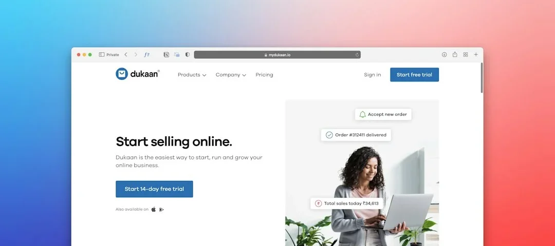
Your call-to-action button is the most important element on the entire page, so it needs to command visual attention. If your page background is white with dark text, your button should be a vibrant, contrasting color like orange, green, or deep blue. Make your CTA button pop so a user’s eyes naturally gravitate toward it within seconds of landing on the site.
Beyond color, pay close attention to the actual text on the button. Avoid boring terms like “Submit” or “Click Here” in favor of action-oriented, value-driven phrases like “Get My Free Guide” or “Start My 14-Day Trial.” When your button tells a micro-story about what the user is gaining, your click-through rates will climb.
Incorporating relevant hero images, videos, or product mockups
Humans are visual creatures who process imagery faster than blocks of text. A great hero image or product mockup helps visitors visualize what they are getting before they read a single paragraph. Show your product in action rather than relying on generic stock photos of people shaking hands in a boardroom.
If you are selling a software platform, use a clean screenshot or a short looping product walkthrough. If you offer a service, include an image that represents the tangible outcome of that service. Visuals should always reinforce your headline’s promise rather than distract from your core conversion goal.
Why social proof and trust signals are non-negotiable
Integrating customer reviews, star ratings, and video testimonials
People are inherently skeptical of marketing claims, and for good reason—everyone says their product is the best. That is why you need real voices to vouch for your offer. Feature genuine customer reviews right near your sign-up forms to ease hesitation and build instant credibility.
Whenever possible, include headshots, full names, and company titles next to testimonials to prove they are real people. Video testimonials work even better because potential customers can hear the enthusiasm and sincerity in the reviewer’s voice. Real-world validation is often the tipping point that turns a hesitant browser into a confident buyer.
Displaying security badges, partner logos, and privacy guarantees
Security concerns will kill a conversion faster than bad copywriting, especially if you are asking for credit card details or personal contact information. Display recognizable trust badges near your forms, such as SSL certificates, money-back guarantees, or payment provider logos like Stripe and PayPal.
Adding a simple privacy note beneath your submit button—such as “We respect your privacy and will never spam you”—goes a long way toward reducing friction. When users feel safe sharing their data, your overall completion rates will improve dramatically.
How to test and optimize your landing page performance
Setting up analytics and conversion tracking tools properly
You cannot improve what you do not measure, and guessing won’t cut it in digital marketing. Before you send a single dollar of paid traffic to your page, make sure your conversion tracking tools are firing correctly. Track every micro-conversion like button clicks and form field completions, not just the final thank-you page load.
Look at heatmaps and session recordings to see where people are clicking and where they are dropping off. If visitors consistently scroll halfway down and abandon the page, you know your message is losing steam at that exact spot. Data removes emotion from design decisions and points you directly toward fixes.
Running A/B tests on headlines, button colors, and form lengths
Landing page optimization is an ongoing experiment, not a one-time project. Once you have steady traffic flowing, start running A/B tests to see what minor tweaks can boost your performance. Test one element at a time, such as changing your headline angle, swapping button colors, or cutting an extra field out of your contact form.
Give each test enough time and traffic to reach statistical significance before declaring a winner. Small, incremental lifts of five or ten percent compound over time, turning an average campaign into a profitable revenue engine.
Step-by-Step Implementation
- Define your primary goal: Decide on one single action you want your visitors to take before you write a single word of copy.
- Map out your wireframe: Sketch a simple layout featuring a headline, subheadline, hero image, benefit bullets, and a prominent call-to-action button.
- Write conversion-focused copy: Craft a clear value proposition that tells the user exactly what they gain and why they should care right now.
- Design without distractions: Remove your main website navigation, sidebars, and footer links to keep user attention locked on the offer.
- Add trust and social proof: Insert authentic customer reviews, star ratings, and security badges near your primary forms to build instant credibility.
- Set up analytics tracking: Install your tracking pixels and conversion goals to monitor visitor behavior and measure your success accurately.
- Launch and test: Send your initial traffic batch to the page, review your heatmap data, and begin running A/B tests to optimize performance.
Frequently Asked Questions
What is the ideal length for a landing page?
The ideal length depends entirely on your offer and price point. Simple lead magnets or app downloads often work best with a short, punchy page above the fold, while expensive enterprise software or complex courses require longer pages to answer objections and build trust.
Should I include links to my blog or social media?
No, you should remove all outbound links, including blogs and social media icons. Every external link is an escape hatch that allows potential leads to wander away from your conversion funnel without taking action.
How much traffic do I need to run an A/B test?
You generally need at least a few hundred conversions per variation to reach statistical significance. If your traffic is low, focus on making bold, high-impact changes rather than microscopic tweaks.
What makes a good call-to-action button?
A great call-to-action button uses a high-contrast color that stands out from the rest of the page. It also features clear, action-driven text telling the user exactly what benefit they will receive upon clicking.
Key Takeaways
- Always establish a singular conversion goal before designing or writing your landing page content.
- Eliminate all site navigation menus and distractions to keep visitor focus locked on your core offer.
- Prioritize clarity over cleverness in your headlines by directly communicating the primary user benefit.
- Incorporate authentic social proof and security badges to reduce user skepticism and build instant trust.
- Rely on continuous data tracking and structured A/B testing to maximize your long-term conversion rates.
Next Steps
Audit your current landing page against the core principles outlined above to spot immediate areas for improvement. Remove unnecessary distractions, sharpen your headline, and set up proper tracking before launching your next traffic campaign.
Photo by Team Nocoloco on Unsplash · Photo by Jonathan Borba on Unsplash
 Skills & Courses
 Skills & Courses
 Skills & Courses